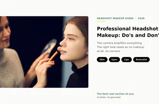
Tips
The Best Professional Headshot Backgrounds for 2026: Colors, Settings, and What Actually Works
Gray, charcoal, blue, or on-location? The right headshot background depends on your industry, your face, and your light. Here are the 2026 standards, by color and setting, plus what to do when you can't control where you shoot.
Your face is the first thing people read in a headshot. The background is the second, and it's the first thing people miscalibrate.
A great background does its job quietly. It stays out of the way, it signals the right level of formality for your industry, and it holds up when your photo is rendered at the size of a coin on a LinkedIn feed or blown up across a conference badge. A bad background does the opposite. It pulls attention, competes for color, and dates the shot in ways the face never will.
The good news: you've got three ways to land a great background. You can choose the right one before you shoot, you can build one at home with what you've got, or you can fix one after the photo is captured. We'll walk through all three, plus the color and trend choices that actually matter in 2026.
What's the best background for a professional headshot?
A solid, neutral background in light gray, charcoal, off-white, or soft blue is the safest universal pick for a professional headshot. The background's only job is to disappear so your face wins. Specific industries lean specific colors (charcoal for executives, white for healthcare, blue for finance), and on-location settings work for creative roles when softly blurred. Pick a color that contrasts your skin and outfit, and keep it clean.
The three jobs your headshot background has to do
A useful background isn't doing anything you'd describe as "design work." It's doing three quiet jobs at once, and most amateur headshots get tripped up because one of the three is missing.
Job one: stay out of the way. Your face is the focal point. The background's contribution is contrast, not content. The moment a viewer's eye wanders to a bookshelf, a doorframe, or a logo on the wall, the photo has already lost.
Job two: signal the right level of formality. A charcoal seamless reads as authority. A softly-blurred office reads as approachable expertise. A natural park reads as warmth and accessibility. None of these is universally "right." The right background matches what your audience expects to see for someone in your role.
Job three: hold up at every size. Your headshot is going to appear at the size of a LinkedIn thumbnail, an email signature, a conference badge, an internal directory tile, and (occasionally) a wall print. A background with a lot of texture or detail looks fine in one of those sizes and weird in the others. A clean, simple one reads consistently across all of them.
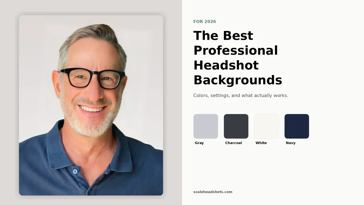
Best background colors for professional headshots
Color is the lever most people overweight and underdeliver on. Here's the working palette, ordered by safety.
Light gray (universal safe pick). If you're paralyzed by choice, light gray wins for 80 percent of professional contexts. It's neutral enough to read as professional in any industry, contrasts cleanly with most skin tones and outfits, and lets your face stay the focal point. It works for sales leaders, account executives, consultants, marketers, and anyone whose headshot has to feel competent without telegraphing a specific industry. When in doubt, this.
Charcoal (the 2026 trend for authority). Charcoal sits between gray and black, and it's the fastest-growing background category in corporate photography in 2026. It carries the gravitas of a dark background without the staged, theatrical feel of full black. It works for executives, partners, senior leaders, and anyone whose headshot is doing authority work. Pair it with a darker outfit (navy, charcoal, deep neutrals) for cohesion; a light blouse or shirt against charcoal creates strong contrast that reads as confidence.
Off-white and clean white (healthcare and government default). White strips away all visual context and puts every pixel of attention on your face. That's the right call for healthcare provider directories, government agencies, badge photography, and anywhere the headshot's job is identity verification more than personal expression. The risk: pure white can wash out lighter complexions and bright outfits at thumbnail size, and the photo dissolves into the page chrome around it. Off-white or warm white solves both.
Soft blue and blue gradient (trust signal for finance and law). Blue is the most trusted color in business, and a muted blue background does work that's hard to do with neutrals. It signals stability, dependability, and a non-trendy seriousness. It's the right call for finance, banking, legal, and corporate roles where trust is the headline outcome. Stick to muted, desaturated blues; anything saturated reads as branded marketing material instead of a professional headshot.
Warm neutrals and earth tones (creative and hospitality). Soft beige, warm gray, dusty rose, and muted earth tones add approachability without losing professionalism. They're a fit for creative directors, wellness practitioners, hospitality leaders, and roles where warmth is part of the brand. Use them with intention; they don't carry the universal appeal of cool neutrals.
Bold and colored backgrounds (creative roles, proceed with care). Saturated jewel tones, brand colors, and deeply colored backgrounds can be powerful for creative roles, founders building personal brands, and contexts where the headshot is part of an explicitly designed identity system. They earn attention. They also age fast, lock you into a single brand context, and limit reuse. Use only when the background is a deliberate part of your brand story, not a default.
Different industry, different background
What reads as "professional" varies by industry. A charcoal-seamless that lands authority in a law firm partner photo can read as stiff in a creative agency. Our industry guides break down what each field actually expects, with examples.
See the industry guidesIndoor backgrounds: studio, office, and at-home setups
Indoor backgrounds give you the most control. Three configurations cover almost every real-world use case.
Studio seamless. A solid roll of seamless paper or fabric, usually in light gray, charcoal, white, or a brand color, with even strobe lighting in front of it. This is the photographer's classic setup and the visual most people picture when they say "professional headshot." It produces the cleanest, most consistent results across an entire team. The downside is access; most people aren't booking a studio session every time they need an updated photo.
Softly-blurred office. Your actual workspace, captured at a long focal length with a wide aperture so the office reads as soft, blurred context behind you. This works when you want the photo to feel earned rather than staged. The key is "softly blurred." If the desk, bookshelf, or window detail is sharp enough to identify, it's competing with your face. Best for founder portraits, sales leaders, executives whose work environment is part of the brand, and anyone in a role where context adds credibility.
Clean home wall. A solid, neutral wall in your home, captured against natural window light. This is the most accessible option, and with the right setup it's nearly indistinguishable from a studio shot at thumbnail size. Stand 4 to 6 feet in front of the wall so any texture softly blurs out behind you. Avoid bookshelves, kitchens, doorframes, and anything visually busy. If you're going this route, our at-home capture guide walks through the full setup.
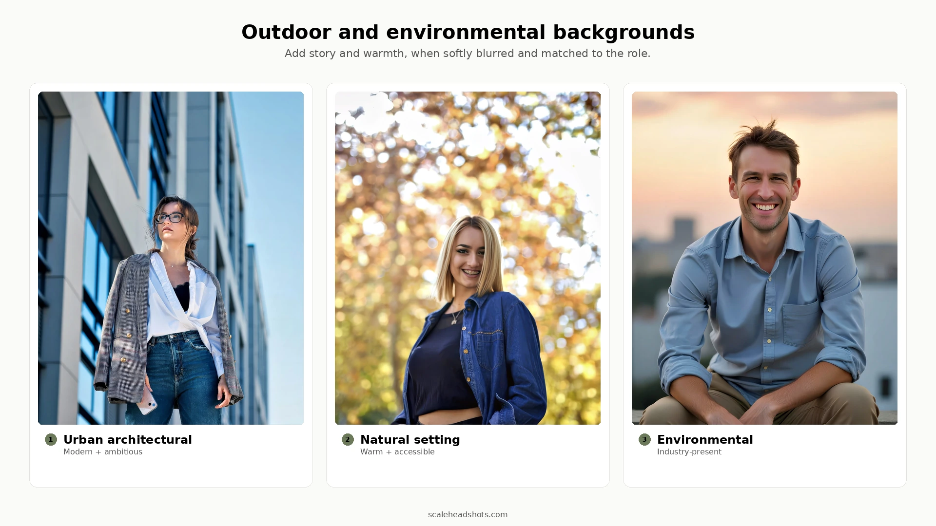
Outdoor and environmental backgrounds: when they work, when they don't
Outdoor backgrounds add warmth, energy, and a story your studio shot can't tell. They also require more capture discipline and they don't work for every role. The rule of thumb: the background should be softly blurred so it reads as context, not as competing visual information.
Where outdoor works. Creative directors, founders, hospitality leaders, real estate agents, journalists, and anyone whose brand benefits from looking present in a real place. An urban architectural backdrop signals modern and ambitious. A natural park or treeline signals warmth and accessibility. A softly-blurred storefront or hospitality setting signals presence in the industry. These are not generic outdoor shots; they're location choices that say something specific about the work.
Where outdoor doesn't work. Conservative legal and finance contexts where every partner's headshot is on a neutral studio backdrop. Healthcare directories that expect clinical consistency. Anywhere your team's headshots have to read as cohesive at a glance; a single outdoor shot in a grid of studio shots is visually jarring. Internal directory and badging contexts where the background is irrelevant to the use.
Capture rules. Overcast days produce the most flattering outdoor light. Direct sun creates harsh shadows; if you have to shoot in it, position yourself with the sun behind you and use the building or trees as a soft fill. Frame your subject so the background is at least 6 to 10 feet behind them, then use a long focal length to compress and blur it. The closer the background is to your subject, the harder it works to fight back into focus.
For a deeper outdoor playbook, see our outdoor headshots guide.
What's trending in 2026: charcoal, gradients, and visible skin texture
Backgrounds change slowly, but they do change. Four shifts are worth knowing in 2026.
Charcoal is replacing pure black for authority. Pure black backgrounds read as theatrical and staged in 2026. Charcoal carries the same gravitas without the drama and pairs better with the natural-light, less-retouched look that's defining modern executive photography.
Subtle gradients are replacing flat solids as the default. A background that fades softly from one neutral tone to another (light gray drifting to medium gray, for example) reads as dimensional and modern without calling attention to itself. Flat backgrounds are starting to look slightly dated, especially at larger sizes.
Environmental and on-location backgrounds are gaining ground in executive and founder portraits. The "softly-blurred real workplace" look is moving from creative-only into mainstream executive use, partly because it photographs as more authentic than seamless paper, and partly because remote and hybrid teams are leaning into "you can tell I actually work somewhere" cues.
Visible skin texture is in; heavy smoothing is out. This is a wardrobe-of-the-face change more than a background change, but it affects what backgrounds look right next to it. The over-retouched, fashion-magazine smoothing of the 2010s pairs awkwardly with the natural backgrounds that dominate 2026. Less smoothing, less staging, less perfection.
We treat all four as observational, not prescriptive. If your role is partner at an established law firm, the conservative studio backdrop your team has been using for ten years still works. If you're rebuilding your brand or you're newer to your role, the 2026 trends are where the visual baseline is heading.
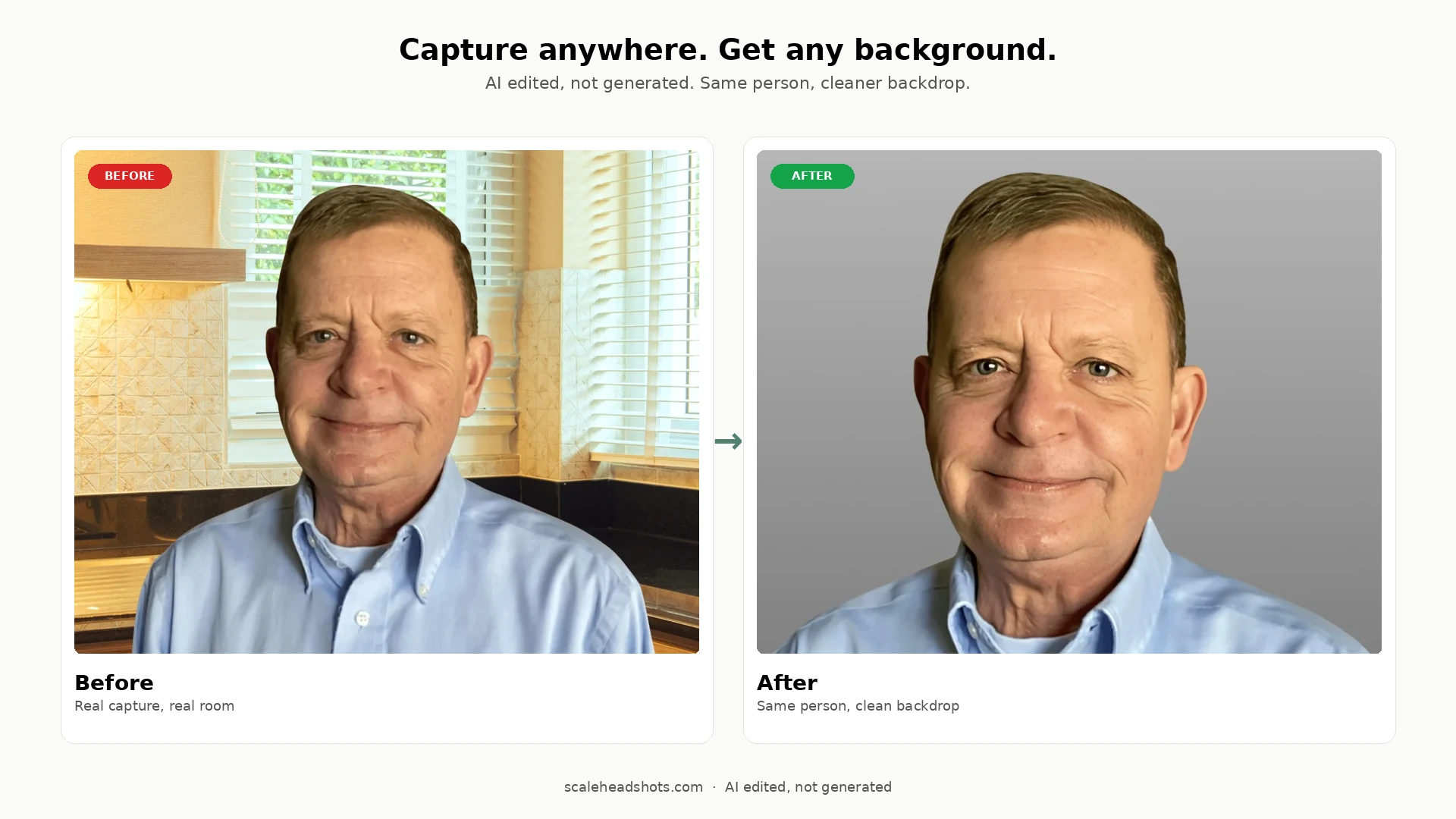
Can't control your background? Fix it after.
Here's the part the rest of the internet skips. Every other "best backgrounds for headshots" guide treats the background as a capture-time decision: pick the right wall, find the right park, book the right studio. But most headshots aren't captured in controlled conditions. They're captured wherever the person actually was, and the background is whatever the room gave them.
That's the lane our platform is built for. Upload one photo, captured wherever you actually were, and Scale replaces the background with a clean professional one without changing what you look like. The wall behind you in your home office becomes a light gray seamless. The fluorescent-lit conference room becomes a softly-blurred environmental context. The mismatched team photos from 12 different home offices in 5 countries become a single visually-consistent set.
This is AI edited, not generated. We're working with a real photo of you, applying enhancement (background cleanup, lighting balance, color correction, sharpening) without inventing new features or changing your face. That's different from AI-generated headshots, which create entirely synthetic images and often drift from how you actually look.
The practical implications: you stop optimizing for the wall behind you and start optimizing for the things AI can't fix (your expression, your framing, your light direction). And teams get consistency without flying in a photographer or aligning twelve schedules.
See how it works on our features page, or check pricing for the per-credit cost.
What background color is best for a LinkedIn headshot?
Light gray is the universal safe pick for LinkedIn. It works at thumbnail size (which is what LinkedIn actually shows most of the time), it contrasts with the LinkedIn page chrome, and it doesn't carry industry baggage.
If you want to stand out in a feed without breaking norms, charcoal or muted blue are the strongest alternatives. Charcoal adds authority and pairs well with dark outfits; muted blue adds trust and pairs well with anything. Both read as intentional rather than accidental.
Avoid pure white at thumbnail size. LinkedIn shows your headshot at roughly the size of a coin, and white backgrounds dissolve into the page chrome around them, which makes your face appear to float oddly on the page. Off-white or warm white solves this without changing the underlying clean-and-clinical feel.
For the full step-by-step on capturing and uploading a LinkedIn headshot, see our LinkedIn headshot guide.
Gray, white, or charcoal: which one's actually best?
This is the question every "best backgrounds" article ends on, and it doesn't have a single answer. Each one works; the right call is downstream of your industry, your skin tone, and your outfit.
Gray wins as the default. Light gray is the safest universal pick across industries, outfits, and skin tones. If you're paralyzed by choice, it's the answer roughly 80 percent of the time.
White wins for healthcare, government, and any context where the headshot's job is identity verification more than personal expression. It strips away context and puts every pixel on your face. The risk is wash-out at thumbnail size, especially with lighter complexions and bright outfits, so use off-white or warm white if you can.
Charcoal wins when authority is the brief. Executives, partners, senior leaders, anyone whose headshot is doing gravitas work. It's the 2026 trend for a reason; it carries weight without the staged feel of pure black.
Bonus answer: when in doubt, capture against whatever clean background you've got, then change it after. The capture-time decision matters less than it used to.
Frequently Asked Questions
What's the best background color for a professional headshot?
[object Object]
Is gray or white better for headshots?
[object Object]
What background should I use for a LinkedIn headshot?
[object Object]
Are dark and charcoal backgrounds trending in 2026?
[object Object]
What about outdoor or environmental backgrounds, when are they appropriate?
[object Object]
Can I change my headshot background after the photo is taken?
[object Object]
Do I need a professional studio for a great background?
[object Object]
Still have questions? Get in touch and we'll be happy to help!
Capture anywhere. Get any background.
Upload one photo from wherever you actually were. Get a clean professional headshot with the background of your choice, your industry's style, and every output format you need: square for LinkedIn, transparent PNG for badges, signature crop for email. Start free with three credits.